
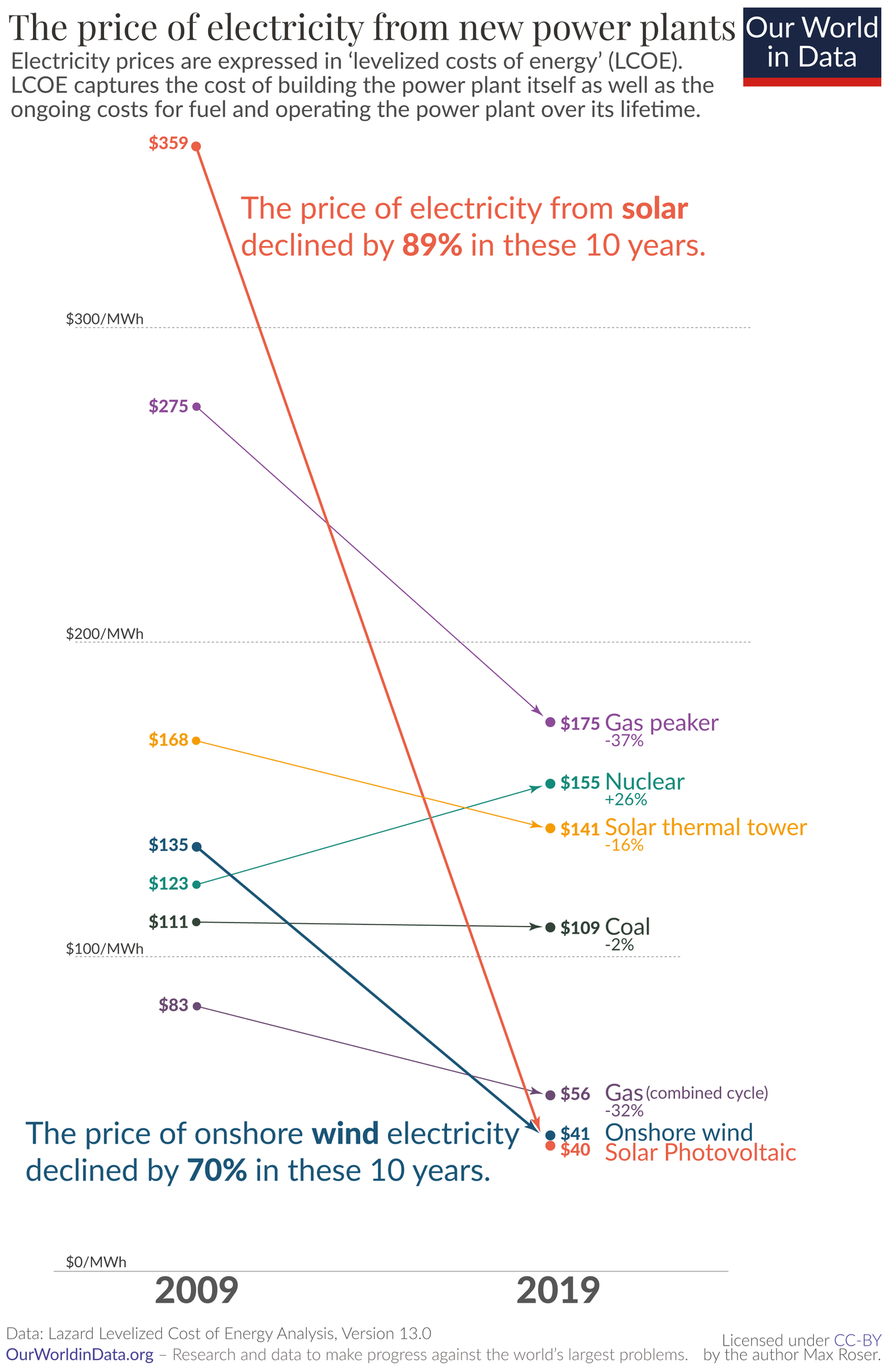
Solar now being the cheapest energy source made its rounds on Lemmy some weeks ago, if I remember correctly. I just found this graphic and felt it was worth sharing independently.
Solar now being the cheapest energy source made its rounds on Lemmy some weeks ago, if I remember correctly. I just found this graphic and felt it was worth sharing independently.
The cost of the panels themselves doesn’t seem to have gone down nearly that much.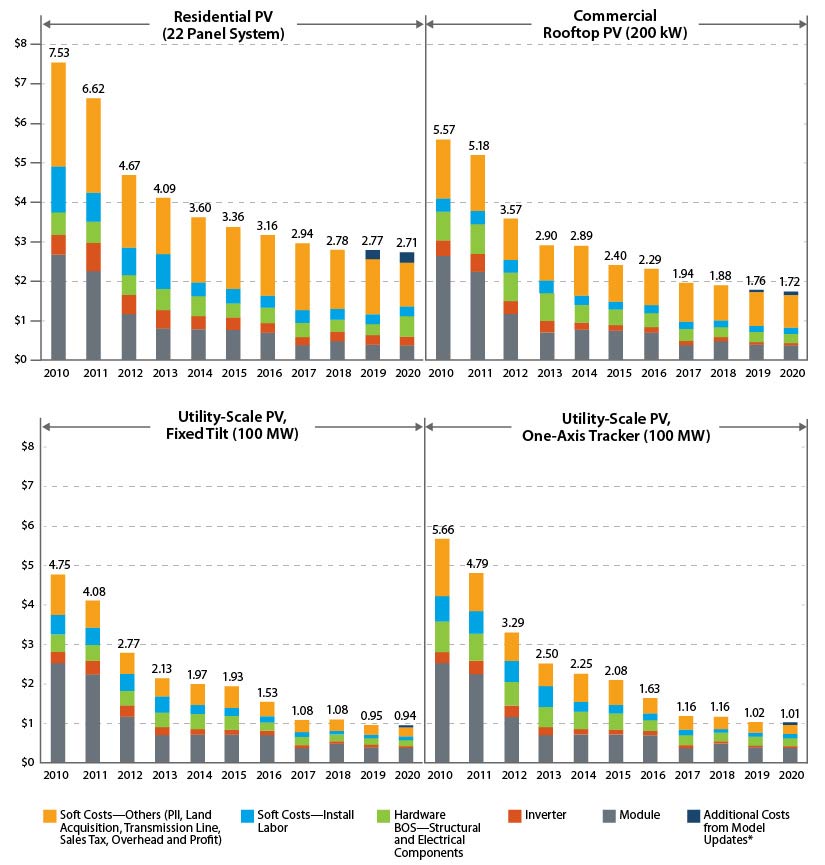
OP’s data is LCOE, which takes into account much more than $/MW. Rather importantly, expected operating liftetime is a major component (and historically THE major economic downside of PV).
IIRC, LCOE is calculated for utility-scale solar, which has seen a 500% decrease according to your chart.
Finally, Neither chart specifies, but if OP’s is in constant dollars and yours isn’t that would explain a lot as well.