Reddit refugee here.
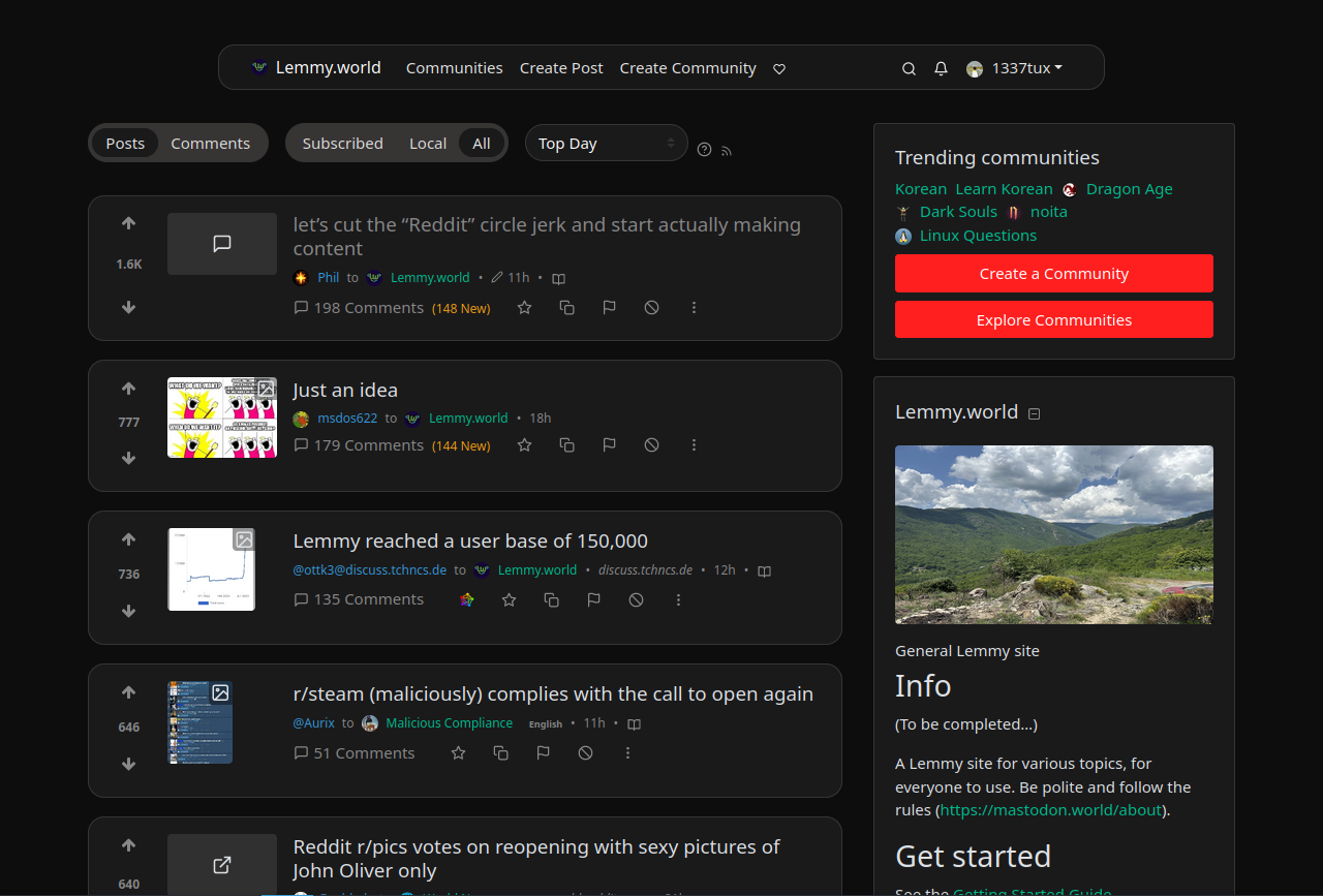
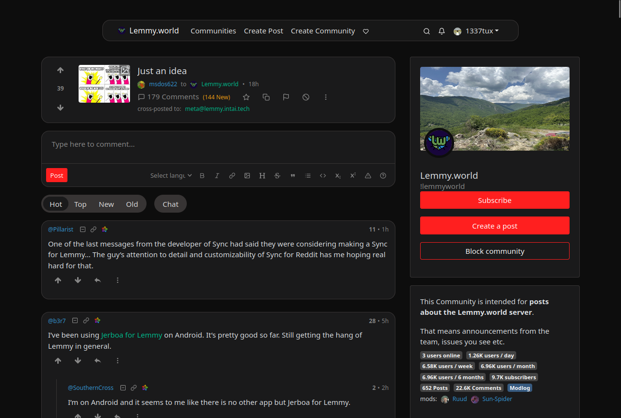
I have really started to like Lemmy and love the fact that it’s free and open source, but I wasn’t feeling so home with the UI, so I found nice looking style from https://userstyles.world/style/10345/lemmy-world but I personally prefer dark theme so I adjusted some colours and made the radiuses and margins bigger. I thought that maybe someone will find this useful and hence I decided to post it here. I am not a professional programmer, just a guy who likes to tinker with computers so this style may not be perfect. Critique, feedback and suggestions are welcome.


Edit: The colors are from reddit and if you want the colors to look more like the original lemmy, change the bg primary and default to hex #303030 and #222222. I really like this color scheme too
--bg-primary: #303030;
--bg-default: #222222;


This is just me but I missed the day when the site provided us to customize our profile page. Like friendster for example we can change the look of the buttons, we can change the size of the fonts and etc.
It shows us a little bit of our personality. But I know that it’s no longer a thing. The closes experience I could think of is how we design our linux desktop. In windows it would be using rainmeter.