I don’t know about all of you, I don’t like these new flat icons that everyone is using. What ever happened to the old icons, like on iPhone and Samsung they used to have them years ago. Those were good times. Now it is always these stupid boring cartoonish designed icons. Side note: Somebody please update this icon pack. I am trying to use it on xfce on arch but some of the icons aren’t working properly because it hasn’t been updated in a while. I’ll donate to you right away if you do it. Link to the repo: https://github.com/madmaxms/iconpack-obsidian
Sometimes I think that I miss skeuomorphism, but then I realize it’s not the skeuomorphism that I miss, but my childhood and days when the world was much simpler.
Would I like to bring back skeuomorphic UIs? Yes.
I’m too old to be nostalgic for skeuomorphism. But a retina-burning amber monochrome monitor, text mode, with menus and UIs built out of ASCII graphics, or at best, 640 x 480 CPU-driven graphics modes? Now you’re talking.
From my perspective, the skeuomorphic era of the early-late 2000s is still “modern”.
Ha, you and me both buddy, although I like retina burning green :). Let me know what you think of my personal profile site: www.gradyp.com, made it just for the graybeard aesthetic.
How do I type something? There’s a cursor but keyboard input doesn’t work for me. You oughtta make it do some dummy commands for fun, or better yet, some real ones in a sandbox, that’d be neat, for fun user interactivity. Otherwise, looks slick. Good job.
Yeah, entirely fake. But yes, you read my mind, I plan on adding some fun interactivity someday. Plan on some fake terminal commands like ping and so forth.
Thanks for the feedback!
Ya I feel you, I remember I had an iPod when I was a kid with the icons I think it was iOS 6. Now when I try to find skeuomorphic icon packs on Linux it is almost impossibile and the ones you do find are abandoned ☹️
Actually no, I hated the Vista era UI design. Linux themes were positively garish, add MacOS looked like a candy store. CDE greatly impressed me back then. It looked like it was made by adults for adults. Highly legible, and the pastel colors are being emulated by Solarized.
I’m sure that those UIs were a product of the times. The 90’s and noughties were loud and colorful and exciting and everything looked like a comic. Now that we live in more depressing times, we can look to the science of perceptual psychology.
You see, we have an attention budget, we need to process what we see. Visually complex UIs need to be parsed, and that takes mental effort, and that robs us of mental energy to focus on our work. It’s not a crippling effect, but it’s there.
Look at street signs and corporate logos, they easily lodge in our mind. Effective advertising has a clear and simple visual language, and this is what UIs should strive for.
Effective advertising has a clear and simple visual language, and this is what UIs should strive for.
Interfaces can be needlessly complex regardless of being flat or skeuomorphic.
But flat interfaces still require mental effort to parse. Especially when the interface is complex and/or crowded and you’re trying to pick out active UI elements amongst decorations like group boxes/panels.
Essentially, flat interfaces are currently popular because of touchscreen devices. Touchscreen devices have limited space and thus need simplistic UI elements that can be prodded by a fat finger on a small screen.
But I don’t need a flat touchscreen-friendly interface on my non-touch dual 24" monitors with acres of screen real estate. I need an interface that nicely separates usable UI elements from the rest of the application window. That means 3D hints on a 2D screen, which allows my monkey-brain with five million years of evolved 3D vision the opportunity to run my “click the button” mental command as a background process.
You see, we have an attention budget, we need to process what we see. Visually complex UIs need to be parsed
One of the reasons i like interfaces with clear lines. But that doesn’t fit icons, all-same-isch looking rectangles are not easier to parse than “objects”. The mind is optimized for 3D, not for abstract icons.
i actually hate icons with like shading or 3d look. but I don’t really use icons anyway, the only icons i see are in my system tray and when i run wofi
Kinda, yeah! These kinda remind me of some of the icon packs I used on my jailbroken iPod Touch!
Yeah, I don’t understand flatness either. Neither I understand the dark themes either. My eyes and brain simply can’t do the separation easily, I spend more time trying to process an image. Old style icons and UI colors are the best IMHO.
The thing I’m more nostalgic for was the time when everything had to be a glistening amorphous translucent blob, a bit like the Cingular Wireless logo or the MusicMatch Jukebox logo. And I’m in that era where you can just play MSN messenger sounds and you’ll get an OH MY GOD out of me.
I’ve had the MSN message sound as my SMS Ringer for years now. The looks I get from people are fantastic.
Frutiger Aero, I think.
I miss the Vista tingle and shine, and the sounds it had
It seems Nintendo’s consoles (Wii, DS, 3DS) were also more colourful and packed with music and sound then.
The Switch is so quiet. So… Dead?
Sort of. What that page describes is in the same building as what I’m thinking about.
Hey, that’s the icon set I use in KDE! And yes i’d sell my kidneys to bring back skeumorphism and aero
Colorful icons were amazing. That’s literally why the iMac sold so well. Colorful. Prove me wrong.
I miss the KDE 3.x crystal theme
This is the first time Ive ever seen those vowels together
If I understood it correctly, in this context it means that the icons normally retain the original logo and color scheme, while incorporating them into a single style.
a skeuomorph (from greek, “tool/container-shape”) is something that retains the characteristics of another thing that it is based on, even though those characteristics are no longer useful. think lamps shaped like candles, or the floppy disk save icon, or media player programs with volume knobs.
skeuomorphic UX is a good way to get users comfortable with a system by using designs they are already familiar with, and the original iphone used this to great effect.
This is a good example of skeuomorphic UI:
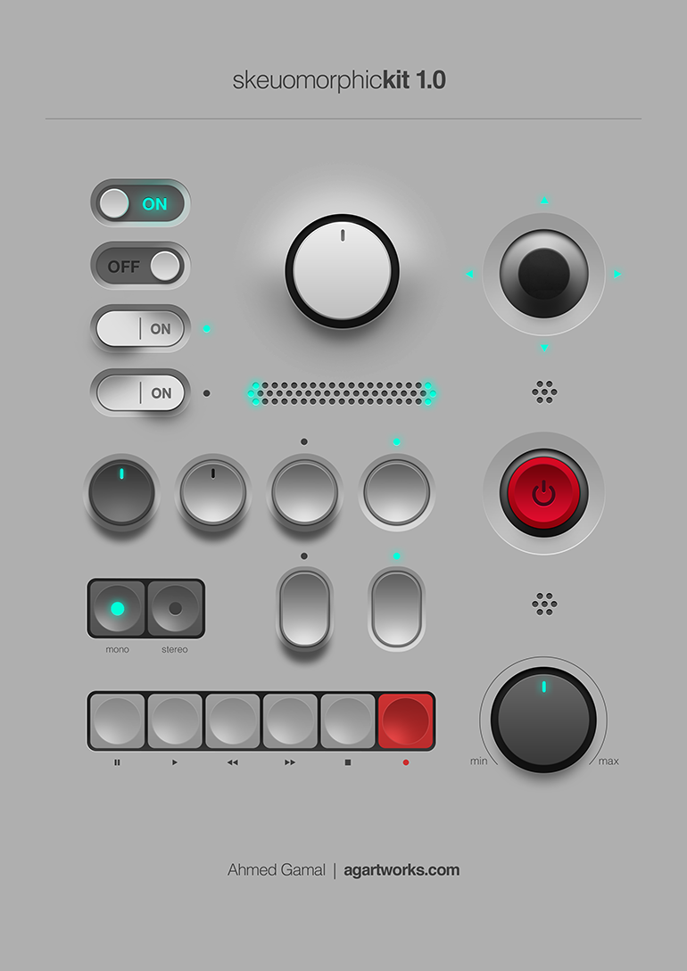
all to say, I’m not entirely sure these icons are skeuomorphs. they’re just glossy.
Wow that is a gorgeous image
Yeh the files being little pieces of paper, and the folders being old office folios are skeumorphic. Skeumorphic was (or is?) sometimes used more generically for ui elements made to look physical so perhaps the pseudo 3D shading, dropshadows, bevels and highlights qualify much of OPs examples, though they aren’t representing any specific type of physical object necessarily. Just objects to be grabbed and used (clicked).
I’m sure trends will bring us back to a similar style at some point like they often do.
it’s weird that. it’s obviously possible to have a flat-shaded skeuomorph, just look at basically all of windows 95, but for some reason we connect them to this particular graphical style. files and folders are both part of the old classic “desktop metaphor”, so they basically have to be skeuomorphs. but like, the application icons are basically just mosaic tiles of the normal icons.
a proper skeuomorph would indicate what the program is for. krita and whatever map software that is are both good, if a little flat. but the libreoffice suite just being squares with a letter on them? have them be like, a spreadsheet for calc, a stack of cards for impress, and a printed page for write.
remember all the icons for windows 95 network utilities that have people in them? those are also (attempts at) skeumorphs because they’re trying to communicate what the program does.
Thanks! Learning more every day
Also, beautiful design, and probably not bad for a touchscreen (terrible for mouse though)
I am a papirus man

For those who haven’t seen snl’s papyrus skit:
https://www.youtube.com/watch?v=jVhlJNJopOQ
Or papyrus 2:
https://www.youtube.com/watch?v=Q8PdffUfoF0
A couple of the best sketches SNL has ever done
I upvoted your comment just because it had links to the reference you made.
Also, the sketches were funny; thanks for sharing them.
I miss the time when not all icons were a rectangle or a circle.
It’s nice and easy on the eyes. I conjecture that glossy and matte (as seen here) styles of skeuomorphism gave way to more abstract design since:
- Skeuomorphism is hard to get just right without being excessive and tacky
- Saturated, simple blocks of color pop out more, particularly on the increasingly prevalent mobile UI
- And thus also have better shelf appeal
If it were up to me, the red line would be when buttons and interactive elements are indistinguishable from text. The stock Android settings is probably among the worst offenders in this regard.
What I really miss is light mode that isn’t hated for blinding users and dark mode that doesn’t plunge the user into the void. Those “toolbars” look lovely, perfect for any lighting condition or time of day. I’ve yet to understand why, at present, designers insist on pure white everywhere when it comes to light mode. Maybe everyone is using the night light filter so it doesn’t matter? At least pure black dark mode makes sense for power efficiency on OLEDs.
Skeuomorphism is hard to get just right without being excessive and tacky
that was always my impression of os x back in the day. it felt tacky as hell. i’m a linux guy, but windows’s aero was so much more beautiful
I tried to do a couple of icon sets that went with that trend for KDE. At one point I was involved with the KDE VDG and was about to set the style of the icons they’d use.
But apparently some suit told them they needed to go completely flat as they needed to plaster Firefox/distros/whatever logos on it, so everything needed to look consistent.
So in the end I got bored about it and stepped away. I’m trying to redo a new square-shaped-skeumorphed icon set but it’s so much work - like it’d need to be your daily job to pull it off.
However, if you take a look at it, it’s already in this one - some of them are just the base shape with some logo plastered on it (like the whatsapp one, or the one with the butterfly) and voilá, there’s your icon.
So icon sets are incredibly hard, and if you want a skeumorphism icon set its hard squared. That’s another of the reasons flat icons thrive today.
I miss UIs having lines and clear separations between elements. I loath this new flat style that everything has to have now, where you can’t tell when one thing stops and another starts.
And you can’t tell when something is active/focused or not because every goddamn app and web site wants to use its own “design language”. Wish I had a dollar for every time I saw two options, one light-gray and one dark-gray, with no way to know whether dark or light was supposed to mean “active”.
I miss old-school Mac OS when consistency was king. But even Mac OS abandoned consistency about 25 years ago. I’d say the introduction of “brushed metal” was the beginning of the end, and IIRC that was late 90s. I am old and grumpy.
I’ve got these articles saved, about the history of brushed metal on Apple software: https://512pixels.net/2013/03/brushed-metal-intro/ https://512pixels.net/2016/11/the-brushed-metal-diaries-beyond-software/
To be honest I loved it … though maybe it has to do with the fact that I have a soft spot for 10.4 Tiger, due to personal (?!) reasons. After Tiger they started progressively tearing down the brushed metal components.
And you can’t tell when something is active/focused or not because every goddamn app and web site wants to use its own “design language”.
The FireTV os is worse. The active focus indicator is different between pages of the OS ignoring apps. Oh and it changes constantly.


