Science-fiction comedy
The first twilight zone. All the followups just lacked the stark yet innocent tone of a someone reasoning with an unjust reality.
I’ve been making my way through the original recently, one-by-one and though some of them are hit and miss, even the misses are doing something amazing cinematically.
Diablo 1 and 2 by Blizzard. I guess maybe the 2nd time around was perfection but between those two, nothin further was needed.
Diablo 2 also had an expansion… and balance patches… But I agree.
I bought the whole battle chest back in the early 2000s (well my parents did for me). I consider those to be part of Diablo 2 broadly speaking
If you haven’t played it, path of Diablo is a really fun Diablo 2 mod.
Hadn’t heard of it before. Searched for it, and came across both Path of Diablo, and Project diablo. Some polls suggested preferring the latter 2:1. I haven’t played D2 in a few decades (sheesh). Any thoughts on comparing those mods?
I personally prefer Median XL. If it were a choice between PoD or PD, I’d say PoD.
Alien. Maybe my only 10 out of 10 movie, and not my favorite!
We’ve all seen it so many times it loses it’s luster. Wife had never seen it so I sat with her in the dark and watched it for the first time in decades. Jesus. She was about to tear through the couch cushion in stress. I knew what was going to happen and couldn’t peel my eyes off the TV.
Pandorum re-awakened that feeling for me. I also that feeling was dead, but nope still Alice and well
Truly one of the best movies ever made.
Splatoon. The design, the music, the art, the gameplay and the idea was executed so well.
You dawg; you’re perfect!
Highlander :P
There should have been only one.
Zing! Love it. <3
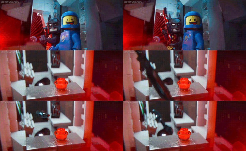
Batman hitting his target with a batterang.
The Princess Bride.
Inconceivable!
Inconceivaballs
In this thread: people living in fantasy lands.
Jackson’s Lord of the Rings. All three are the absolute pinnacle of every craft represented in them. (i.e.: camera work, costumes, casting, CG, practical effects, soundtrack, and all the rest.)
That was not the first film adapatation
I thought it was a huge disappointment, most of all due to the CG.
- Everything looks hueless, often with only a few colors, with weird light angles and enemies often shown as a blur. As if it was made to put everyone on the same level as those who are colorblind and visiually impaired.
- Soundtrack was a dissonance of what went on on screen.
- The towns and villages were beautifully animated and showed wide shots of them, so one could be sure that they were missing any signs of food production or water sources.
- The world did not just look dry in color, but also literally dry. Especially the shire which gives it a plastic feel to it.
All of those put together made me feel it was taking place on a pre-dinosaur earth or not yet fully terraformed planet Mars, rather than a place of fantasy and wonder.
And Saruman’s death was absent in the theatrical cut. One of the most important parts of the story was simply cut out.
Your mom
Working analog clock minute hands after the first minute.
My kitchen must have is an analog clock.
Years of training and using it daily, never wore a watch and don’t give a shit what time it is when I am out of the kitchen.
Was only a few years ago I realized that the minute hand is entirely superfluous for most applications. You can easily tell what ten minute interval of the day you are in by looking only at the hour hand.
On a large enough clock, the hour hand could have easily visible marks for not just minutes, but also seconds. If I were an architect or whatever I would try to make that the floor of a lobby or something.

You could have posted this as a top-level reply to the question…
Windows Control Panel. Everything’s there, multiple ways to sort it all, no need to go shake things up
Oh hell no. You don’t remember it coming out and everyone complaining about how convoluted it was. Pepperidge farm remembers.
People complained that a few things were hard to find, but not that the control panel itself was convoluted.
Ah yes. Perfection:

Or maybe:
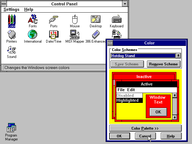
No? maybe this.

Edit I missed windows XP

No shakeups at all, it’s like a rock.
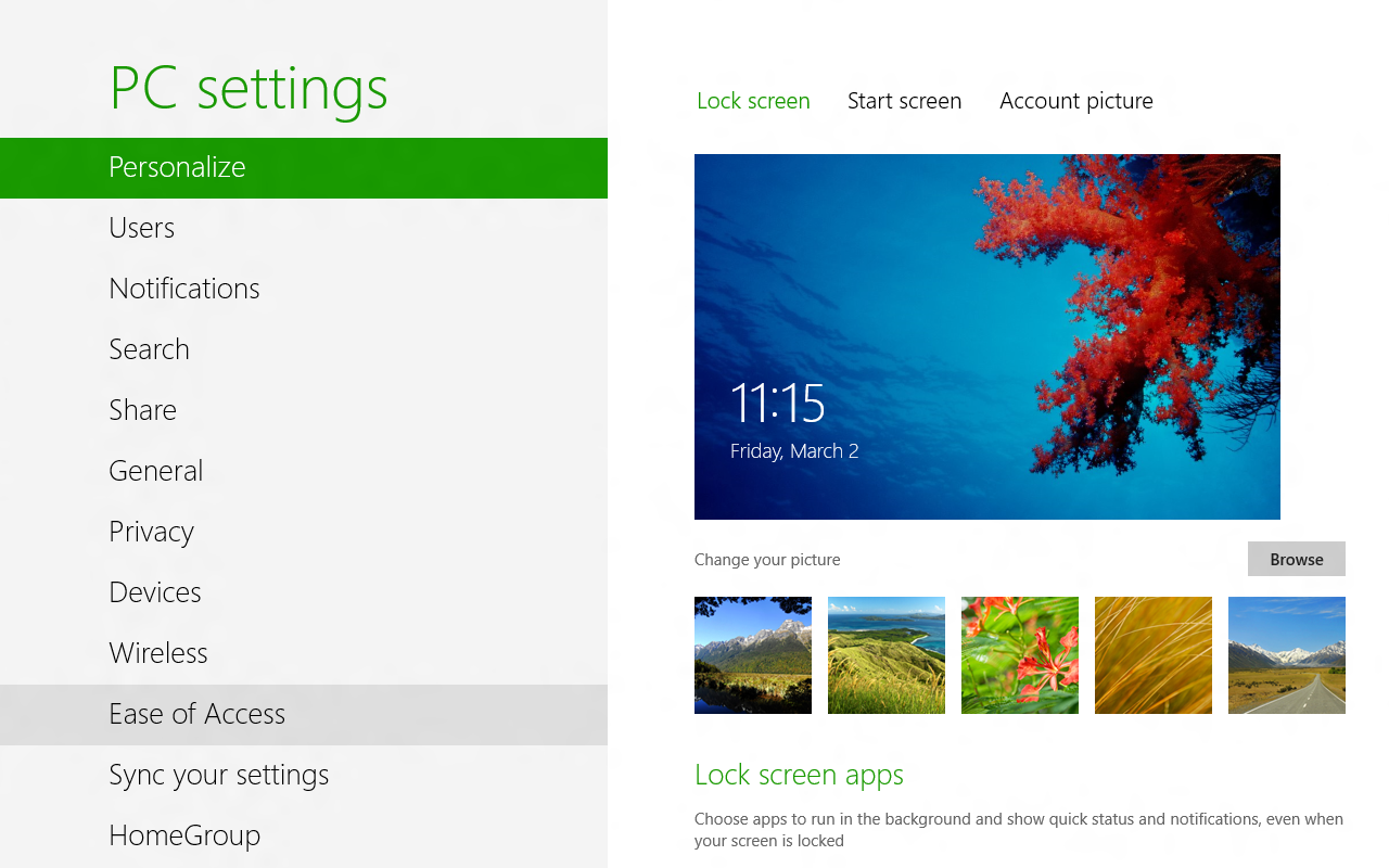
Perfectly reliable and unchanged from the beginning.

Edit since folks choose to distinguish “Settings” from “Control Panel” as if that doesn’t make the point even stronger. I’ll admit that it’s been pretty consistent since Windows 7. Still very different than the first iteration.

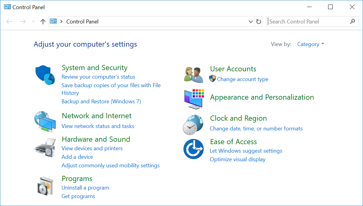
This comment is a time capsule goddamn
Hot Dog Stand Color Scheme lol
Control panel is that drawer of tools, tape, rubber bands, and glue that’s near the kitchen
top right: view by category. switch that to classic and it’s back to the same one of the old days
Well, the last 2 images you linked are Settings and not Control Panel, from versions that decided to not only have that but also the Control Panel, and Control Panel is thematically the same across all versions
That makes it worse! Clearly they did not get it right the first time around, or there wouldn’t be any reason to tweak and replace it all constantly.
there wouldn’t be any reason to tweak and replace it all constantly.
There really wasn’t.
Tetris
I remember watching a documentary about it, and I think even tetris was based on one of those physical puzzle games with the same pieces, that you had to fit correctly into a square.
It’s the closest thing to a “perfect” game I can think of. Every new iteration is just fancy bells and whistles on the same perfect core.
You’re welcome
You can’t take credit when you’re the 11th attempt.
No no, that’s not 11, that’s one one
So the third attempt? My binary is rusty.
I think it’s 1 of 1.


